用于展示用户操作、任务的进度。支持条形与环形两种形态。
示例图
基础用法
页面 .json 文件 usingComponents 中引入组件
// json
{
    "usingComponents": {
        "mx-progress-bar": "/components/mxwui/progress-bar/index"
    }
}
页面 .wxml 文件中使用组件
<mx-progress-bar percent="{{50}}" />
<mx-progress-bar type="circle" percent="{{50}}" />
更多用法示例
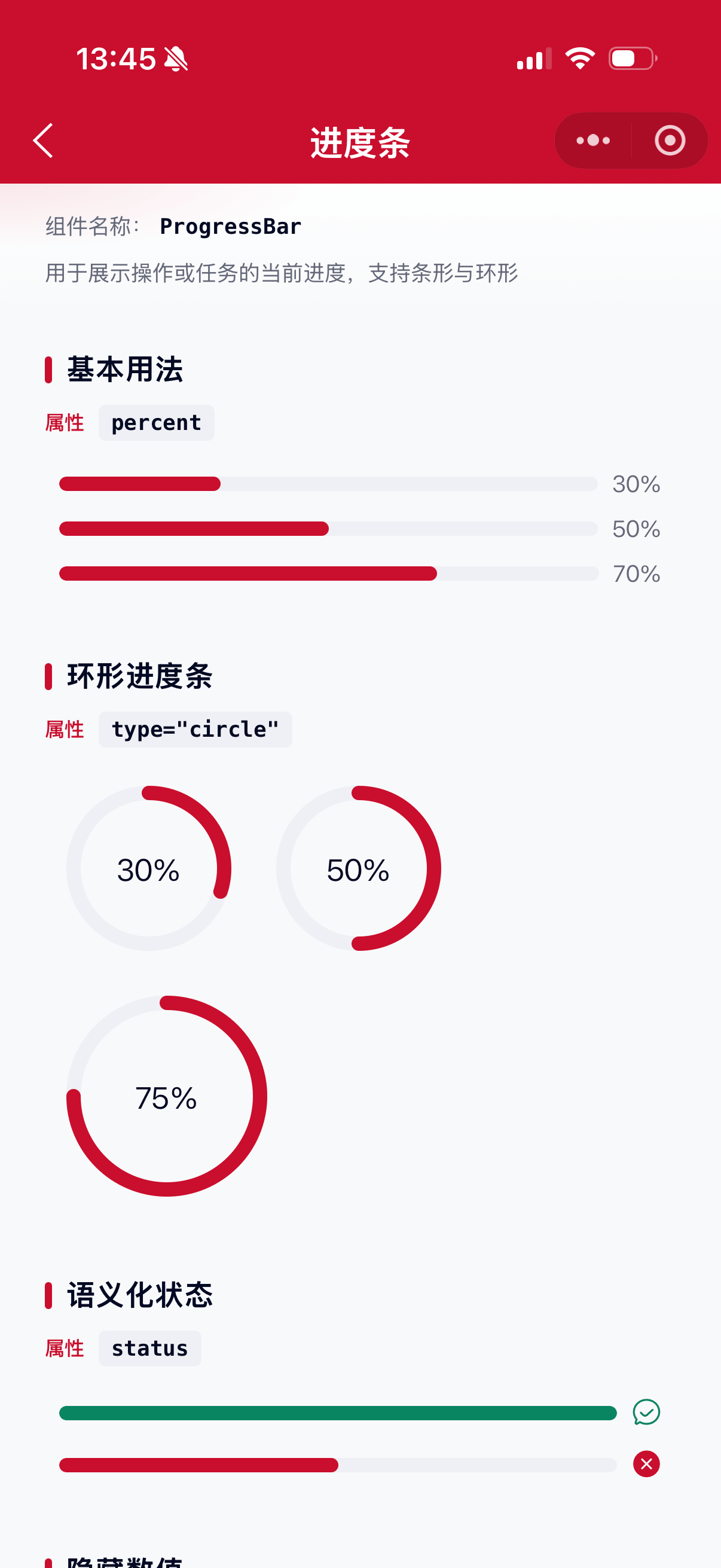
当前进度 percent
属性:percent,默认 0,范围 0-100。超出范围会自动截断。
<mx-progress-bar percent="{{30}}" />
<mx-progress-bar percent="{{70}}" />
类型 type
属性:type,可选 line、circle,默认 line。
- 条形
<mx-progress-bar type="line" percent="{{50}}" />- 环形
<mx-progress-bar type="circle" percent="{{50}}" />语义化状态 status
属性:status,仅限 line 模式语义展示,可选 success、exception。
成功态会显示成功图标并使用成功色;异常态显示关闭图标并使用异常色。
<mx-progress-bar percent="{{100}}" status="success" />
<mx-progress-bar percent="{{50}}" status="exception" />
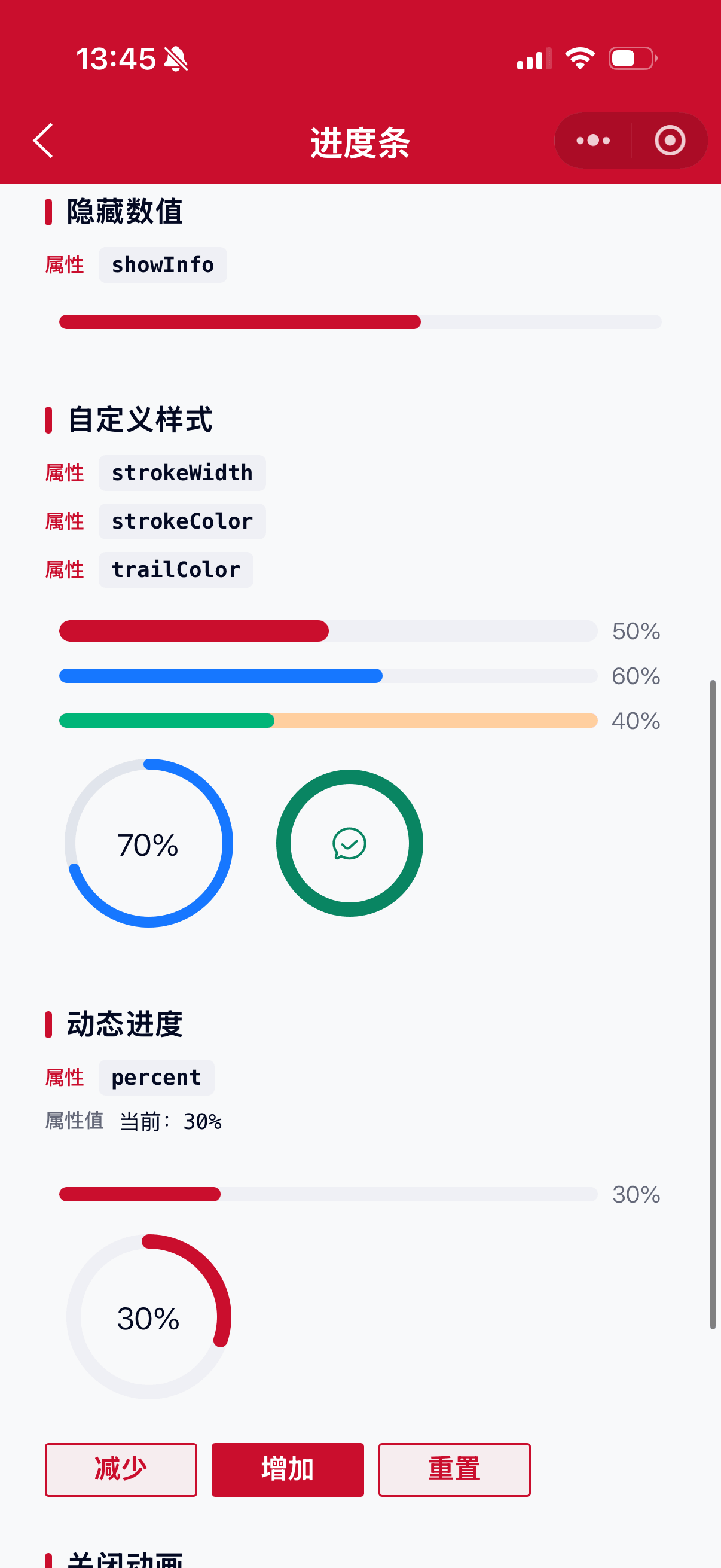
进度条颜色 strokeColor
属性:strokeColor,进度条填充色。默认主题色 #CA0E2D;success 默认 #098562,exception 默认 #CA0E2D。传入后优先生效。
<mx-progress-bar percent="{{60}}" strokeColor="#1677FF" />轨道颜色 trailColor
属性:trailColor,未完成轨道色,默认 #EFF0F5。
<mx-progress-bar percent="{{40}}" trailColor="#FFCF9F" strokeColor="#00B578" />进度条宽度 strokeWidth
属性:strokeWidth,单位 px,默认 8。条形模式下控制高度,环形模式下控制描边宽度。
<mx-progress-bar percent="{{50}}" strokeWidth="{{12}}" />
<mx-progress-bar type="circle" percent="{{50}}" strokeWidth="{{6}}" />
环形画布宽度 width
属性:width,仅 type="circle" 时生效,单位 px,默认 100。
<mx-progress-bar type="circle" percent="{{75}}" width="{{120}}" />是否显示信息 showInfo
属性:showInfo,默认 true。为 false 时不展示百分比或状态图标。
<mx-progress-bar percent="{{60}}" showInfo="{{false}}" />过渡动画 animation
属性:animation,默认 true。关闭后进度变化无过渡效果。
<mx-progress-bar percent="{{80}}" animation="{{false}}" />环形推进速度 speed
属性:speed,仅环形有效,每次绘制推进的角度(deg),默认 6。
<mx-progress-bar type="circle" percent="{{80}}" speed="{{10}}" />参数
| 参数 | 类型 | 必填 | 可选值 | 默认值 | 参数描述 |
|---|---|---|---|---|---|
| percent | Number | 0-100 |
0 |
当前进度百分比 | |
| type | String | line、circle |
line |
进度条类型 | |
| status | String | success、exception |
'' |
语义化状态(主要用于 line) | |
| strokeColor | String | 颜色值 | '' |
进度条颜色,空则按状态/主题色 | |
| trailColor | String | 颜色值 | #EFF0F5 |
轨道颜色 | |
| strokeWidth | Number | 数字 | 8 |
进度条宽度,单位 px | |
| width | Number | 数字 | 100 |
环形画布宽度,单位 px | |
| showInfo | Boolean | true、false |
true |
是否显示百分比或状态图标 | |
| animation | Boolean | true、false |
true |
是否开启过渡动画 | |
| speed | Number | 数字 | 6 |
环形每次推进角度 |
其他说明
percent支持数字或数字字符串,非法值按0处理。- 环形进度条基于
canvas绘制,同页多个实例互不影响。 status与strokeColor同时传入时,以strokeColor为准。