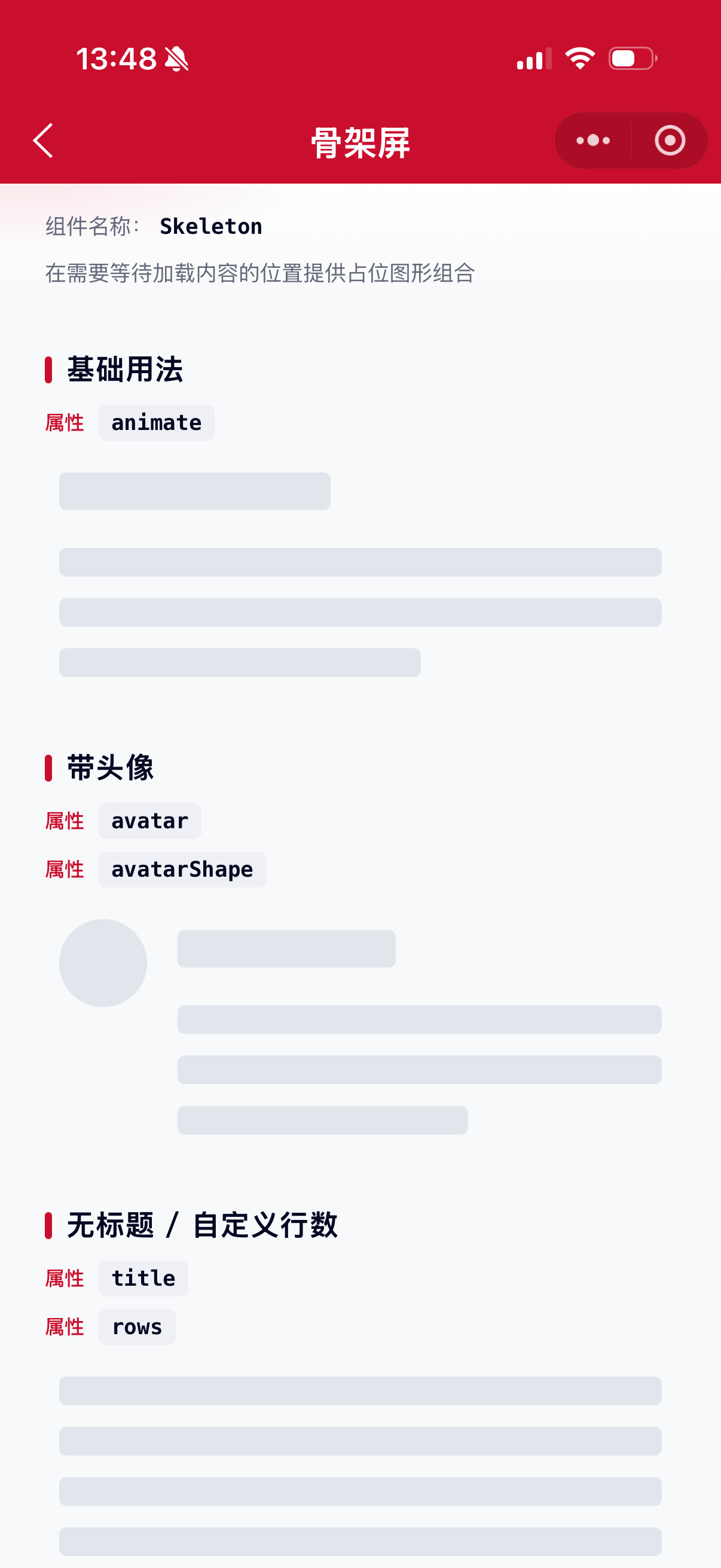
在需要等待加载内容的位置提供占位图形组合。适用于图文信息较多的首页、列表与卡片;网络较慢且仅首次加载时使用。
示例图
基础用法
页面 .json 文件 usingComponents 中引入组件
// json
{
    "usingComponents": {
        "mx-skeleton": "/components/mxwui/skeleton/index",
        "mx-skeleton-avatar": "/components/mxwui/skeleton/avatar/index",
        "mx-skeleton-title": "/components/mxwui/skeleton/title/index",
        "mx-skeleton-paragraph": "/components/mxwui/skeleton/paragraph/index",
        "mx-skeleton-button": "/components/mxwui/skeleton/button/index",
        "mx-skeleton-input": "/components/mxwui/skeleton/input/index",
        "mx-skeleton-custom": "/components/mxwui/skeleton/custom/index"
    }
}
页面 .wxml 文件中使用组件
<mx-skeleton animate="{{true}}" />更多用法示例
动画 animate
属性:animate,是否展示扫光动画,默认 false。
<mx-skeleton animate="{{true}}" />头像 avatar / avatarShape / avatarSize
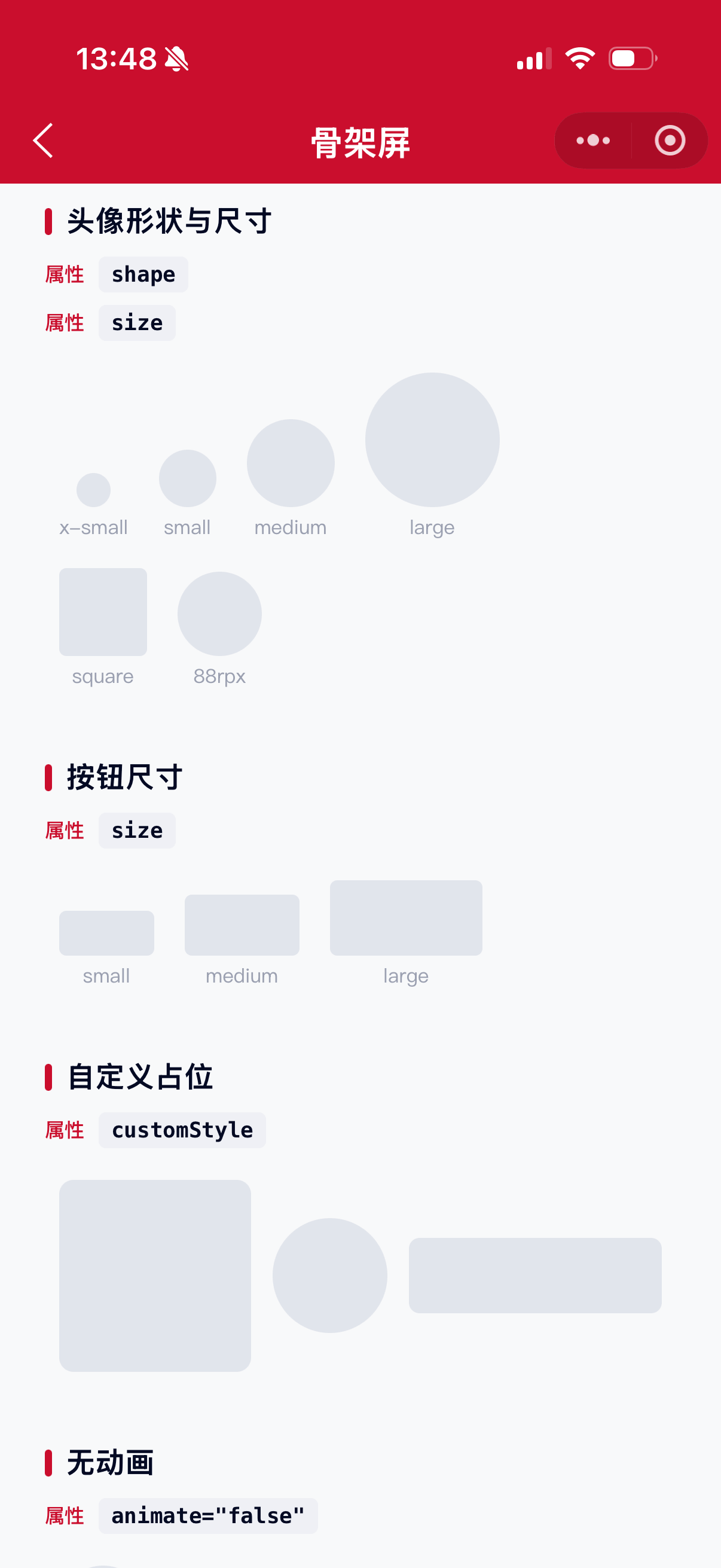
属性:avatar 是否显示头像占位;avatarShape 可选 circle、square,默认 square;avatarSize 可选 x-small、small、medium、large,或自定义尺寸如 88rpx,默认 medium。
<mx-skeleton
    animate="{{true}}"
    avatar="{{true}}"
    avatarShape="circle"
    avatarSize="large"
/>
标题与段落 title / rows
属性:title 是否显示标题占位,默认 true;rows 为段落行数,大于 0 展示,默认 3。
<mx-skeleton title="{{false}}" rows="{{5}}" animate="{{true}}" />加载切换 loading
属性:loading,为 true 时显示占位图,为 false 时展示子节点内容,默认 true。
<mx-skeleton loading="{{showLoading}}" animate="{{true}}" avatar="{{true}}">
    <view>真实内容</view>
</mx-skeleton>
自定义组合
可单独使用子组件自由拼装。
<mx-skeleton-avatar animate="{{true}}" shape="circle" size="large" />
<mx-skeleton-title animate="{{true}}" />
<mx-skeleton-paragraph animate="{{true}}" rows="{{2}}" />
<mx-skeleton-input animate="{{true}}" />
<mx-skeleton-button animate="{{true}}" size="medium" />
自定义占位 custom
属性:customStyle 控制宽高与圆角,用于自定义形状。
<mx-skeleton-custom
    animate="{{true}}"
    customStyle="width:200rpx;height:200rpx;border-radius:16rpx;"
/>
参数
Skeleton
| 参数 | 类型 | 必填 | 可选值 | 默认值 | 参数描述 |
|---|---|---|---|---|---|
| loading | Boolean | true |
为 true 时显示占位图,反之展示子节点 | ||
| animate | Boolean | false |
是否展示动画效果 | ||
| avatar | Boolean | false |
是否显示头像占位 | ||
| title | Boolean | true |
是否显示标题占位 | ||
| rows | Number | 3 |
段落行数,大于 0 展示 | ||
| avatarSize | String | x-small、small、medium、large 或自定义尺寸 |
medium |
头像大小 | |
| avatarShape | String | circle、square |
square |
头像形状 | |
| customStyle | String | CSS 字符串 | '' |
根节点自定义样式 |
Skeleton Avatar
| 参数 | 类型 | 必填 | 可选值 | 默认值 | 参数描述 |
|---|---|---|---|---|---|
| loading | Boolean | true |
为 true 时显示占位图,反之展示子节点 | ||
| animate | Boolean | false |
是否展示动画效果 | ||
| shape | String | circle、square |
square |
头像形状 | |
| size | String | x-small、small、medium、large 或自定义尺寸 |
medium |
头像大小 | |
| customStyle | String | CSS 字符串 | '' |
根节点自定义样式 |
Skeleton Title
| 参数 | 类型 | 必填 | 可选值 | 默认值 | 参数描述 |
|---|---|---|---|---|---|
| loading | Boolean | true |
为 true 时显示占位图,反之展示子节点 | ||
| animate | Boolean | false |
是否展示动画效果 | ||
| customStyle | String | CSS 字符串 | '' |
根节点自定义样式 |
Skeleton Paragraph
| 参数 | 类型 | 必填 | 可选值 | 默认值 | 参数描述 |
|---|---|---|---|---|---|
| loading | Boolean | true |
为 true 时显示占位图,反之展示子节点 | ||
| animate | Boolean | false |
是否展示动画效果 | ||
| rows | Number | 3 |
段落行数,大于 0 展示 | ||
| customStyle | String | CSS 字符串 | '' |
根节点自定义样式 |
Skeleton Button
| 参数 | 类型 | 必填 | 可选值 | 默认值 | 参数描述 |
|---|---|---|---|---|---|
| loading | Boolean | true |
为 true 时显示占位图,反之展示子节点 | ||
| animate | Boolean | false |
是否展示动画效果 | ||
| size | String | small、medium、large |
medium |
按钮尺寸 | |
| customStyle | String | CSS 字符串 | '' |
根节点自定义样式 |
Skeleton Input
| 参数 | 类型 | 必填 | 可选值 | 默认值 | 参数描述 |
|---|---|---|---|---|---|
| loading | Boolean | true |
为 true 时显示占位图,反之展示子节点 | ||
| animate | Boolean | false |
是否展示动画效果 | ||
| customStyle | String | CSS 字符串 | '' |
根节点自定义样式 |
Skeleton Custom
| 参数 | 类型 | 必填 | 可选值 | 默认值 | 参数描述 |
|---|---|---|---|---|---|
| loading | Boolean | true |
为 true 时显示占位图,反之展示子节点 | ||
| animate | Boolean | false |
是否展示动画效果 | ||
| customStyle | String | CSS 字符串 | '' |
根节点自定义样式,常用于宽高与圆角 |
其他说明
- 段落最后一行默认宽度为
60%,用于模拟真实文本排版。 avatarSize/ Avatar 的size支持预设尺寸,也支持直接传入带单位的值(如88rpx)。- 小模块(如弹窗)不建议使用骨架屏;优先考虑预加载。