引导用户按照流程完成任务的导航条。当任务复杂或者存在先后关系时,将其分解成一系列步骤,从而简化任务。
示例图
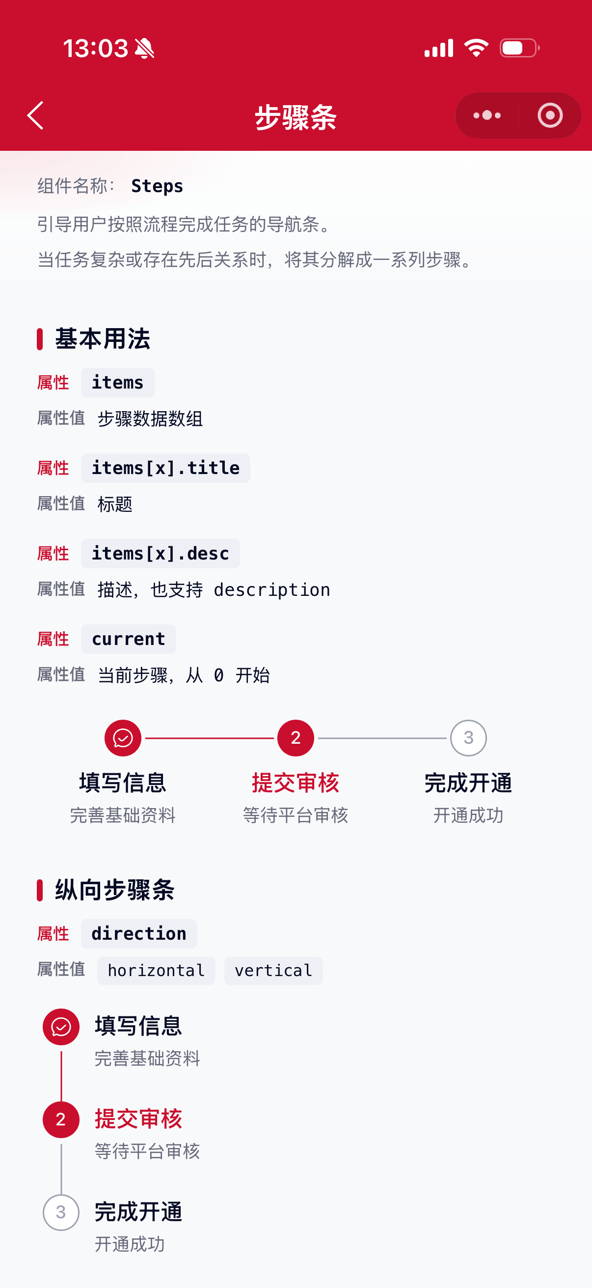
基础用法
页面 .json 文件 usingComponents 中引入组件
// json
{
    "usingComponents": {
        "mx-steps": "/components/mxwui/steps/index"
    }
}
页面 .wxml 文件中使用组件
<mx-steps items="{{items}}" current="{{1}}" />// js
data: {
items: [
{title: '填写信息', desc: '完善基础资料'},
{title: '提交审核', desc: '等待平台审核'},
{title: '完成开通', desc: '开通成功'},
]
}更多用法示例
步骤数据 items
属性:items,数组。
参数:title,标题。
参数:desc / description,描述文案,可选。
参数:status,单项状态,可选 wait、process、finish、error,不传则根据 current 自动计算。
参数:fail,是否为失败步骤,等价于 status: 'error'。
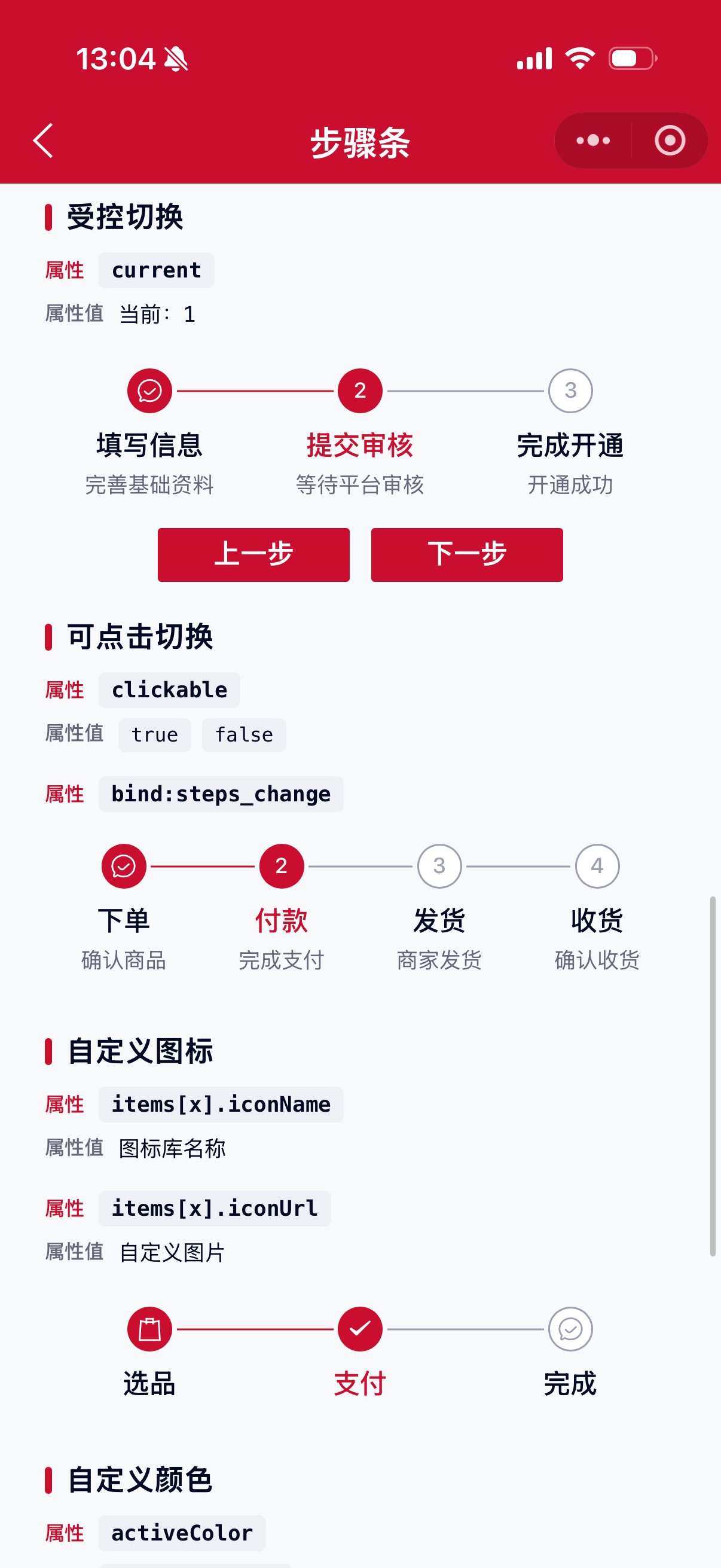
参数:iconName,自定义图标名称(图标库)。
参数:iconUrl,自定义图片地址。
参数:disabled,是否禁用点击,配合 clickable 使用。
// js
data: {
    items: [
        {title: '步骤一', desc: '描述'},
        {title: '步骤二', description: '描述'},
        {title: '步骤三', fail: true},
    ]
}<mx-steps items="{{items}}" current="{{1}}" />当前步骤 current
属性:current,默认 0,从 0 开始计数。
<mx-steps items="{{items}}" current="{{1}}" />方向 direction
属性:direction,可选 horizontal、vertical,默认 horizontal。
- 横向
<mx-steps items="{{items}}" direction="horizontal" />- 纵向
<mx-steps items="{{items}}" direction="vertical" />样式类型 type
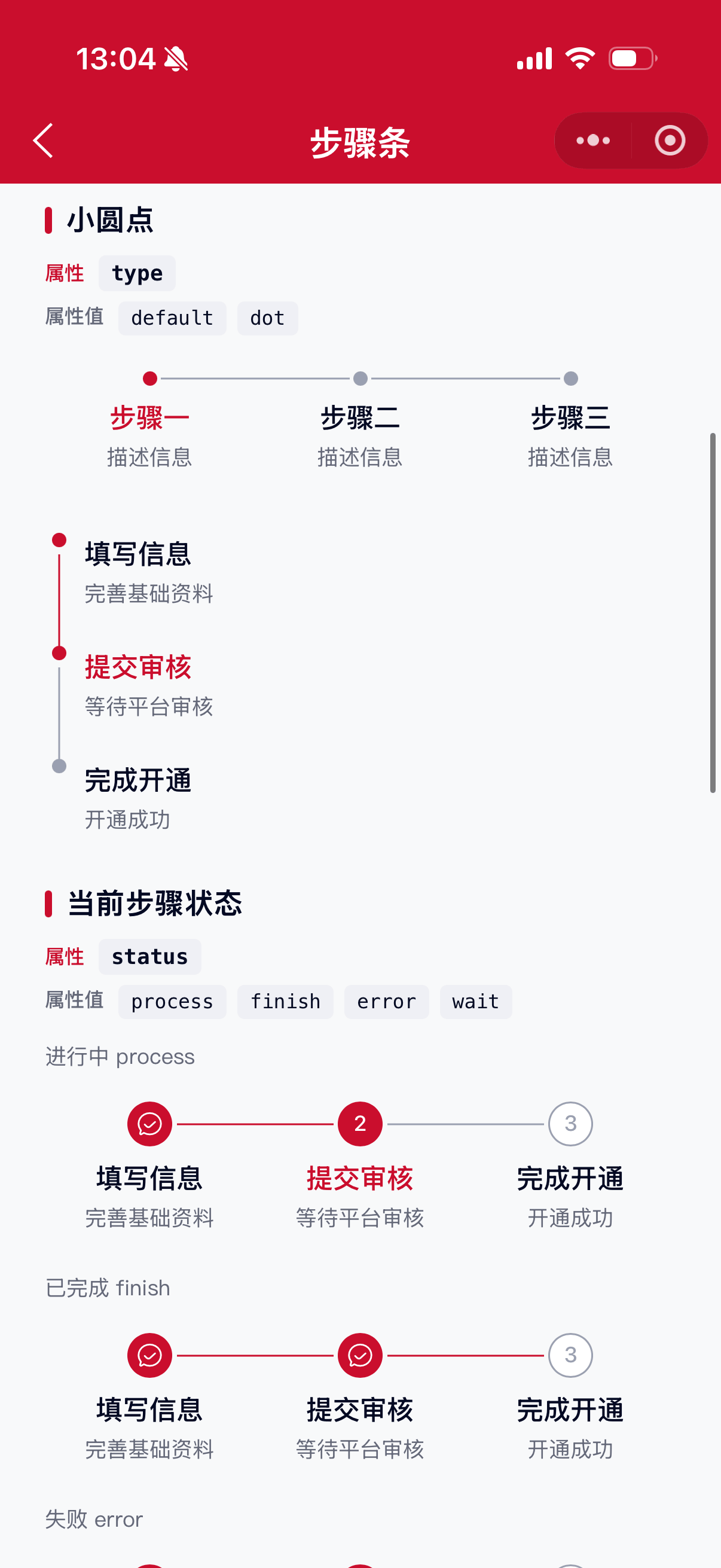
属性:type,可选 default、dot,默认 default。
- 默认(序号/图标)
<mx-steps items="{{items}}" current="{{1}}" />- 小圆点
<mx-steps items="{{items}}" current="{{0}}" type="dot" activeColor="#1677FF" />当前步骤状态 status
属性:status,指定当前步骤(current 对应项)的状态,可选 process、finish、error、wait,默认 process。
<mx-steps items="{{items}}" current="{{1}}" status="error" />

<mx-steps items="{{items}}" current="{{1}}" status="finish" />
可点击切换 clickable
属性:clickable,默认 false。开启后点击步骤可切换,并触发 steps_change。
<mx-steps
    items="{{items}}"
    current="{{current}}"
    clickable
    bind:steps_change="handleChange"
/>
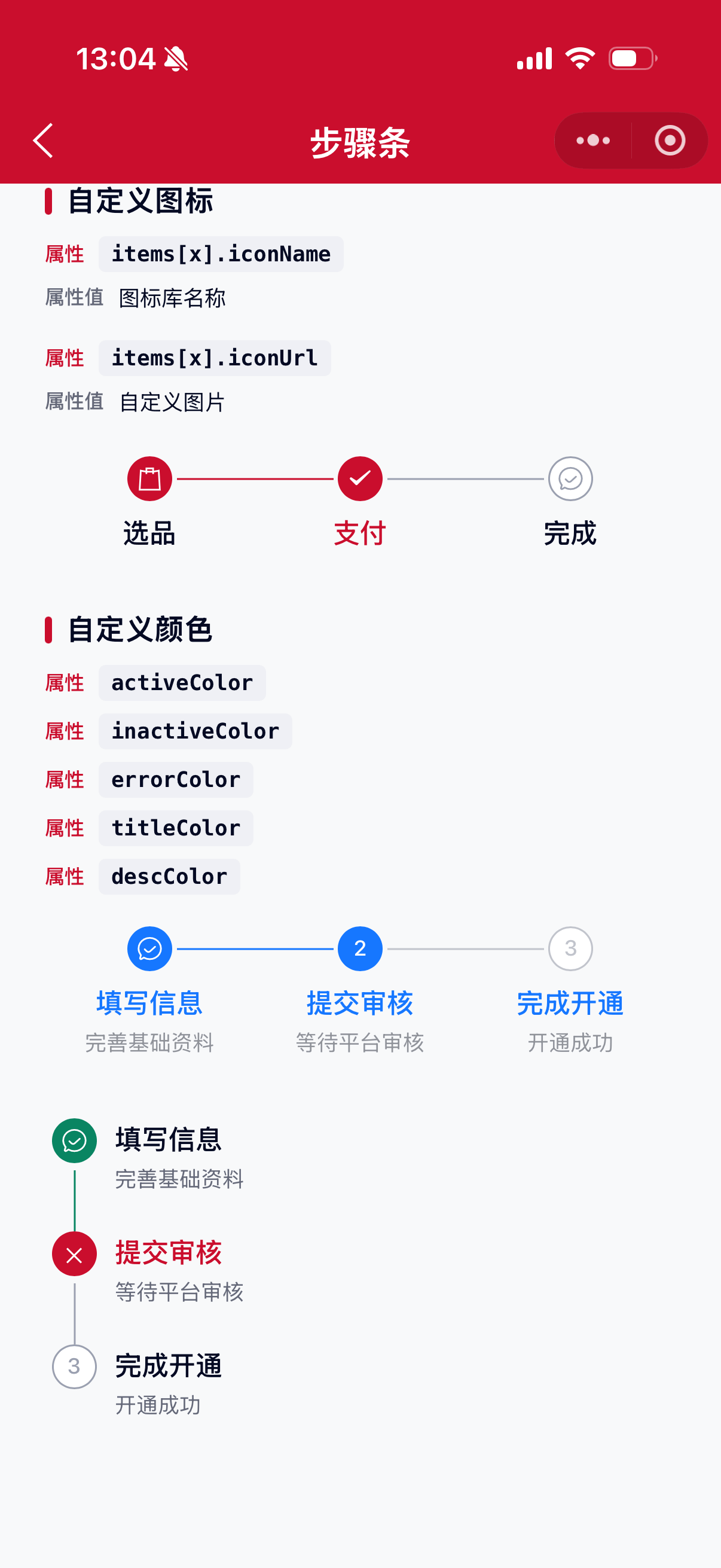
激活色 activeColor
属性:activeColor,默认主题色 #CA0E2D,支持任何合法的颜色值。
<mx-steps items="{{items}}" activeColor="#1677FF" />未激活色 inactiveColor
属性:inactiveColor,默认 #9AA0B1,支持任何合法的颜色值。
<mx-steps items="{{items}}" inactiveColor="#C0C4CC" />错误色 errorColor
属性:errorColor,默认 #CA0E2D,支持任何合法的颜色值。
<mx-steps items="{{items}}" current="{{1}}" status="error" errorColor="#CA0E2D" />标题色 titleColor
属性:titleColor,默认 #040A23,支持任何合法的颜色值。
<mx-steps items="{{items}}" titleColor="#1677FF" />描述色 descColor
属性:descColor,默认 #656979,支持任何合法的颜色值。
<mx-steps items="{{items}}" descColor="#909399" />自定义事件
事件:bind:steps_change,点击切换步骤时触发(需开启 clickable),返回 current、item、status。
<mx-steps
    items="{{items}}"
    current="{{current}}"
    clickable
    bind:steps_change="handleChange"
/>
参数
| 参数 | 类型 | 必填 | 可选值 | 默认值 | 参数描述 |
|---|---|---|---|---|---|
| items | Array | 是 | 步骤数据 | ||
| current | Number | 0 |
当前步骤,从 0 开始 | ||
| direction | String | horizontal、vertical |
horizontal |
方向 | |
| type | String | default、dot |
default |
样式类型,dot 为小圆点 |
|
| status | String | process、finish、error、wait |
process |
当前步骤状态 | |
| clickable | Boolean | true、false |
false |
是否可点击切换 | |
| activeColor | String | 颜色值 | #CA0E2D |
激活/完成色 | |
| inactiveColor | String | 颜色值 | #9AA0B1 |
未激活色 | |
| errorColor | String | 颜色值 | #CA0E2D |
错误色 | |
| titleColor | String | 颜色值 | #040A23 |
标题色 | |
| descColor | String | 颜色值 | #656979 |
描述色 |
items
| 参数 | 类型 | 必填 | 可选值 | 默认值 | 参数描述 |
|---|---|---|---|---|---|
| title | String | 是 | 标题 | ||
| desc | String | 描述(与 description 二选一) | |||
| description | String | 描述(与 desc 二选一) | |||
| status | String | wait、process、finish、error |
单项状态,覆盖自动计算 | ||
| fail | Boolean | true、false |
是否失败步骤 | ||
| iconName | String | 自定义图标名称 | |||
| iconUrl | String | 自定义图片地址 | |||
| disabled | Boolean | true、false |
是否禁用点击 |
事件
| 事件名称 | 类型 | 返回值 | 事件说明 |
|---|---|---|---|
| bind:steps_change | Change | {current, item, status} |
点击切换步骤时触发 |
其他说明
- 不传单项
status/fail时,会根据current与组件status自动区分已完成、进行中、等待中。 desc与description均可作为描述字段,优先读取desc。type="dot"时展示小圆点样式,不再显示序号与图标(iconName/iconUrl也不生效)。