列表的功能扩展。通过滑动操作来展示隐藏的功能菜单,常用于删除、置顶、收藏等场景。
示例图
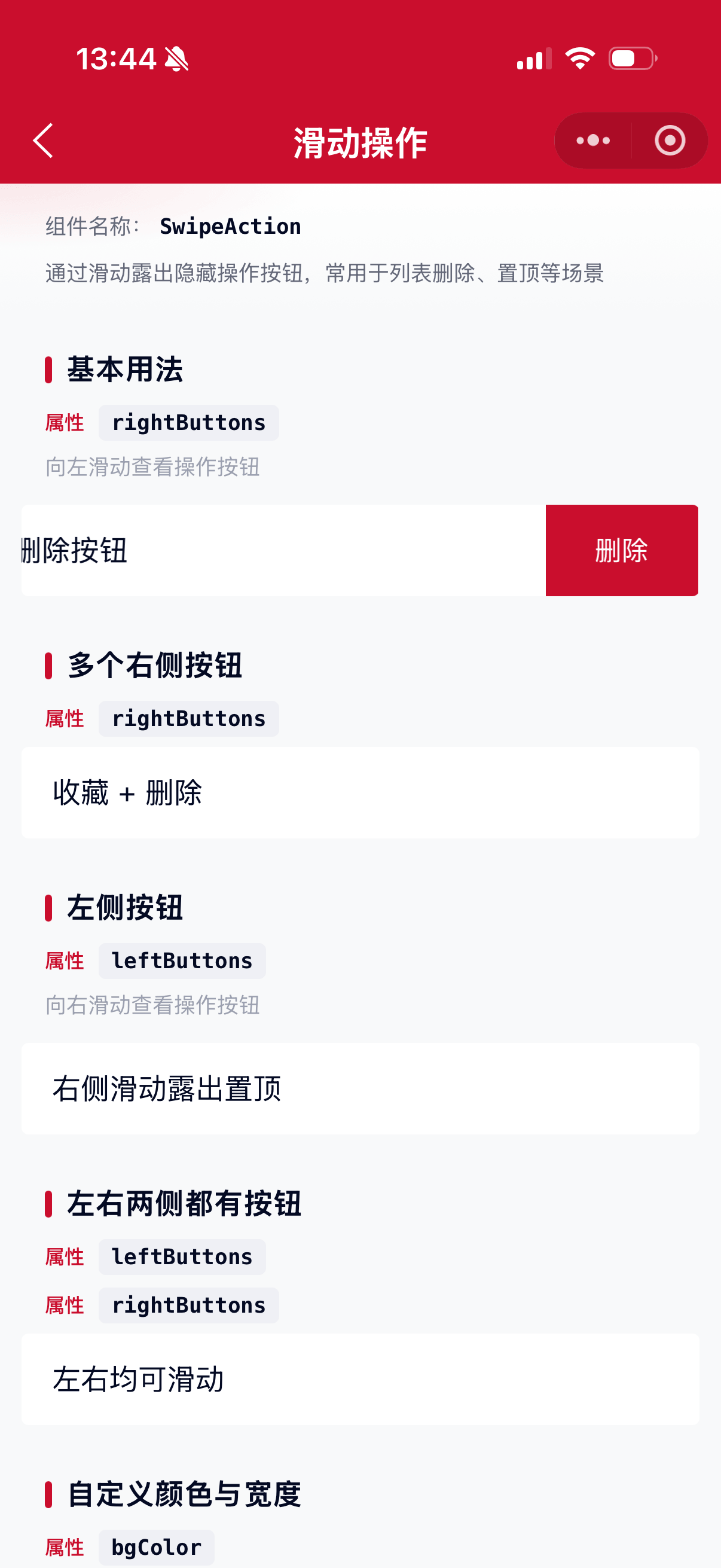
基础用法
页面 .json 文件 usingComponents 中引入组件
// json
{
    "usingComponents": {
        "mx-swipe-action": "/components/mxwui/swipe-action/index"
    }
}
页面 .wxml 文件中使用组件
<mx-swipe-action
    rightButtons="{{[{ text: '删除', type: 'danger' }]}}"
    bind:button_tap="onButtonTap"
>
    <view>左侧滑动露出删除</view>
</mx-swipe-action>
更多用法示例
右侧按钮 rightButtons
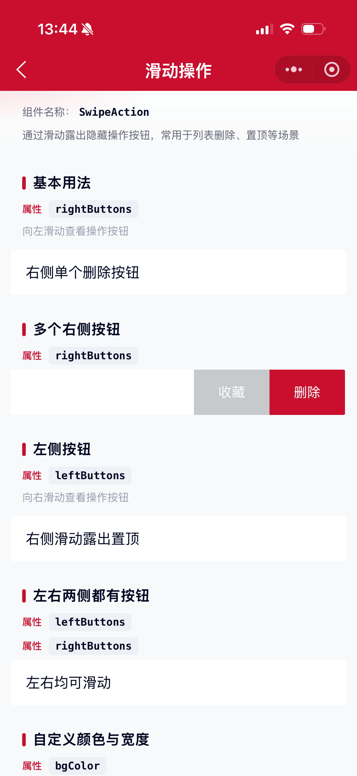
属性:rightButtons,数组。向左滑动露出右侧操作区。
<mx-swipe-action
    rightButtons="{{[
        { text: '收藏', type: 'default' },
        { text: '删除', type: 'danger' }
    ]}}"
    bind:button_tap="onButtonTap"
>
    <view>多个右侧按钮</view>
</mx-swipe-action>
左侧按钮 leftButtons
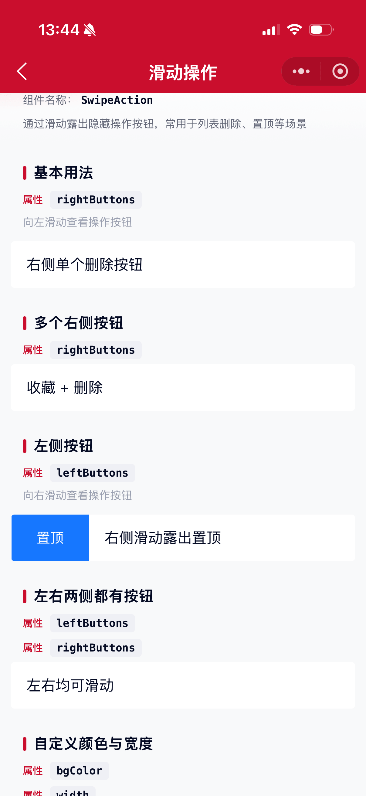
属性:leftButtons,数组。向右滑动露出左侧操作区。
<mx-swipe-action
    leftButtons="{{[{ text: '置顶', type: 'primary' }]}}"
    bind:button_tap="onButtonTap"
>
    <view>右侧滑动露出置顶</view>
</mx-swipe-action>
左右两侧同时配置
可同时传入 leftButtons 与 rightButtons。
<mx-swipe-action
    leftButtons="{{[{ text: '标为已读', type: 'primary' }]}}"
    rightButtons="{{[{ text: '删除', type: 'danger' }]}}"
>
    <view>左右均可滑动</view>
</mx-swipe-action>
按钮类型 type
按钮对象字段 type,可选 default、primary、danger,默认 default。
| type | 默认背景色 |
|---|---|
| default | #C8C9CC |
| primary | #1677FF |
| danger | #CA0E2D |
<mx-swipe-action
    rightButtons="{{[
        { text: '默认', type: 'default' },
        { text: '主要', type: 'primary' },
        { text: '危险', type: 'danger' }
    ]}}"
/>
自定义颜色与宽度
按钮对象支持 bgColor、color、width(单位 rpx,默认 160)、className。
<mx-swipe-action
    rightButtons="{{[
        { text: '编辑', bgColor: '#1677FF', color: '#fff', width: 140 },
        { text: '删除', bgColor: '#CA0E2D', color: '#fff', width: 140 }
    ]}}"
/>
禁止滑动 disabled
属性:disabled,默认 false。
<mx-swipe-action disabled rightButtons="{{[{ text: '删除', type: 'danger' }]}}">
    <view>不可滑动</view>
</mx-swipe-action>
自动收起 autoClose
属性:autoClose,默认 true。点击按钮或内容区域后是否自动收起。
<mx-swipe-action autoClose="{{false}}" rightButtons="{{[{ text: '删除', type: 'danger' }]}}">
    <view>点击后保持展开</view>
</mx-swipe-action>
弹性回弹 elasticity
属性:elasticity,默认 true。拖动越界时是否有轻微回弹。
<mx-swipe-action elasticity="{{false}}" rightButtons="{{[{ text: '删除', type: 'danger' }]}}">
    <view>关闭弹性</view>
</mx-swipe-action>
默认展开 defaultSwiped
属性:defaultSwiped,可选 left、right 或空。非受控模式下默认展开方向。
<mx-swipe-action defaultSwiped="right" rightButtons="{{[{ text: '删除', type: 'danger' }]}}">
    <view>默认展开右侧</view>
</mx-swipe-action>
受控展开 swiped
属性:swiped,可选 left、right、false / ''。传入后由外部控制展开状态。
<mx-swipe-action
    swiped="{{swiped}}"
    rightButtons="{{[{ text: '删除', type: 'danger' }]}}"
    bind:swipe_end="onSwipeEnd"
>
    <view>受控模式</view>
</mx-swipe-action>
标识与透传 name / extra
列表场景可通过 name、extra 区分项,事件回调中原样返回。
<mx-swipe-action
    wx:for="{{list}}"
    wx:key="id"
    name="{{index}}"
    extra="{{item}}"
    rightButtons="{{[{ text: '删除', type: 'danger' }]}}"
    bind:button_tap="onDelete"
>
    <view>{{item.title}}</view>
</mx-swipe-action>
兼容旧版 left / right
兼容 ant-design-mini 旧文档中的 left、right 写法,语义同 leftButtons、rightButtons。
<mx-swipe-action
    right="{{[{ text: '删除', type: 'danger' }]}}"
    bind:right_button_tap="onRightTap"
>
    <view>兼容旧 API</view>
</mx-swipe-action>
事件
<mx-swipe-action
    rightButtons="{{rightButtons}}"
    bind:swipe_start="onSwipeStart"
    bind:swipe_end="onSwipeEnd"
    bind:button_tap="onButtonTap"
    bind:left_button_tap="onLeftTap"
    bind:right_button_tap="onRightTap"
    bind:content_tap="onContentTap"
>
    <view>内容</view>
</mx-swipe-action>Page({
onButtonTap(e) {
// e.detail: { direction, index, text, type, button, name, extra }
console.log(e.detail);
},
onSwipeEnd(e) {
// e.detail: { direction, swiped, name, extra }
}
});组件实例方法
通过 selectComponent 获取实例后可调用:
| 方法 | 说明 |
|---|---|
open(position) |
展开,position 为 left 或 right |
close() |
收起 |
this.selectComponent('#swipe').close();参数
| 参数 | 类型 | 必填 | 可选值 | 默认值 | 参数描述 |
|---|---|---|---|---|---|
| leftButtons | Array | 按钮对象数组 | [] |
左侧按钮(右滑露出) | |
| rightButtons | Array | 按钮对象数组 | [] |
右侧按钮(左滑露出) | |
| left | Array | 按钮对象数组 | null |
兼容旧 API,同 leftButtons | |
| right | Array | 按钮对象数组 | null |
兼容旧 API,同 rightButtons | |
| autoClose | Boolean | true、false |
true |
点击后是否自动收起 | |
| disabled | Boolean | true、false |
false |
是否禁止滑动 | |
| elasticity | Boolean | true、false |
true |
是否开启越界弹性 | |
| damping | Number | 数字 | 70 |
越界阻尼,值越大阻力越大 | |
| swiped | String/Boolean | left、right、false、'' |
null |
受控展开状态 | |
| defaultSwiped | String | left、right、'' |
'' |
非受控默认展开 | |
| name | Any | '' |
标识,事件中回传 | ||
| extra | Any | null |
额外信息,事件中回传 | ||
| className | String | '' |
自定义类名 |
按钮对象 SwipeButton
| 字段 | 类型 | 默认值 | 说明 |
|---|---|---|---|
| text | String | '' |
按钮文案 |
| type | String | default |
default / primary / danger |
| bgColor | String | 按 type | 背景色,优先级高于 type |
| color | String | #FFFFFF |
文字颜色 |
| width | Number | 160 |
宽度,单位 rpx |
| className | String | '' |
按钮自定义类名 |
事件
| 事件名称 | 类型 | 返回值 | 事件说明 |
|---|---|---|---|
| bind:swipe_start | Event | {direction, swiped, name, extra} |
开始滑动 |
| bind:swipe_end | Event | {direction, swiped, name, extra} |
滑动结束(含吸附后状态) |
| bind:button_tap | Event | {direction, index, text, type, button, name, extra} |
点击任一操作按钮 |
| bind:left_button_tap | Event | 同 button_tap | 点击左侧按钮 |
| bind:right_button_tap | Event | 同 button_tap | 点击右侧按钮 |
| bind:content_tap | Event | {position?, name, extra} |
点击内容区域 |
其他说明
- 同页多个
SwipeAction同时只会展开一项,滑动新项时会自动收起其他项。 - 滑动超过按钮区域约
30%宽度后松手会吸附展开,否则回弹收起。 - 建议内容区域铺满宽度,并保证有足够高度以便点击操作按钮。