用于宣传图或广告图的轮播切换。
示例图
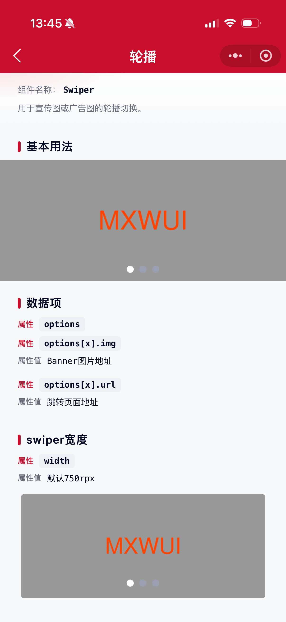
基础用法
页面 .json 文件 usingComponents 中引入组件
// json
{
    "usingComponents": {
        "mx-swiper": "/components/mxwui/swiper/index"
    }
}
页面 .js 文件中定义
// js
data: {
    options: [
        {img: '图片地址', url: '/pages/index/index'},
    ]
}
页面 .wxml 文件中使用组件
<mx-swiper />更多用法示例
数据项 options
属性:options,数据项,必填。
参数:img,图片地址。
参数:url,跳转地址,建议使用小程序地址即 /pages/ 开头的。如果要跳到H5地址,需要配合 customHandle 字段 和 bing:swiper_tap 事件,自行实现点击事件。
除了以上参数,传入的其他参数会原样返回。
// js
data: {
    options: [
        {img: '图片地址', url: '跳转地址'},
    ],
},<mx-swiper options="{{options}}" />swiper宽度 width
属性:width,默认 750rpx,需要带单位。
<mx-swiper width="640rpx" />swiper高度 height
属性:height,默认 320rpx,需要带单位。
<mx-swiper height="300rpx" />swiper圆角 radius
属性:radius,默认 0,数字,不带单位,默认使用rpx。
<mx-swiper radius="4" />是否自动切换 autoplay
属性:autoplay,默认 true 自动切换。
- 自动切换
<mx-swiper />

<mx-swiper autoplay />

<mx-swiper autoplay="{{true}}" />- 不自动切换
<mx-swiper autoplay="{{false}}" />当前所在滑块 current
属性:current,默认 0,数字,不带单位,下标值。
<mx-swiper current="2" />自动切换间隔 interval
属性:interval,默认 5000,数字,不带单位,毫秒。
<mx-swiper interval="3000" />滑动动画时长 duration
属性:duration,默认 500,数字,不带单位,毫秒。
<mx-swiper duration="300" />是否采用衔接滑动 circular
属性:circular,默认 false 不衔接滑动。
- 衔接滑动
<mx-swiper circular />

<mx-swiper circular="{{true}}" />- 不衔接滑动
<mx-swiper />

<mx-swiper circular="{{false}}" />
swiper切换缓动动画类型 xx
属性:easingFunction,可选 default 默认缓动函数、linear 线性动画、easeInCubic 缓入动画、easeOutCubic 缓出动画、easeInOutCubic 缓入缓出动画,默认 default。
- 默认缓动函数
<mx-swiper easingFunction="default" />- 线性动画
<mx-swiper easingFunction="linear" />- 缓入动画
<mx-swiper easingFunction="easeInCubic" />- 缓出动画
<mx-swiper easingFunction="easeOutCubic" />- 缓入缓出动画
<mx-swiper easingFunction="easeInOutCubic" />同时显示的滑块数量 displayMultipleItems
属性:displayMultipleItems,默认 1,数字。
<mx-swiper displayMultipleItems="2" />前边距,可用于露出前一项的一小部分 previousMargin
属性:previousMargin,支持 px 和 rpx。
<mx-swiper previousMargin="20rpx" />后边距,可用于露出后一项的一小部分 nextMargin
属性:nextMargin,支持 px 和 rpx。
<mx-swiper nextMargin="20rpx" />是否显示指示点 showDots
属性:showDots,默认 true 显示指示点。
- 显示指示点
<mx-swiper />

<mx-swiper showDots />

<mx-swiper showDots="{{true}}" />- 不显示指示点
<mx-swiper showDots="{{false}}" />指示点距离底部距离 dotBottom
属性:dotBottom,默认 24,数字,不带单位,默认使用rpx。
<mx-swiper dotBottom="48" />指示点颜色 dotColor
属性:dotColor,默认 #9AA0B1,支持任何合法的颜色值。
<mx-swiper dotColor="#1677FF" />指示点选中颜色 dotActiveColor
属性:dotActiveColor,默认 #FFFFFF,支持任何合法的颜色值。
<mx-swiper dotActiveColor="#1677FF" />指示点形状 dotShape
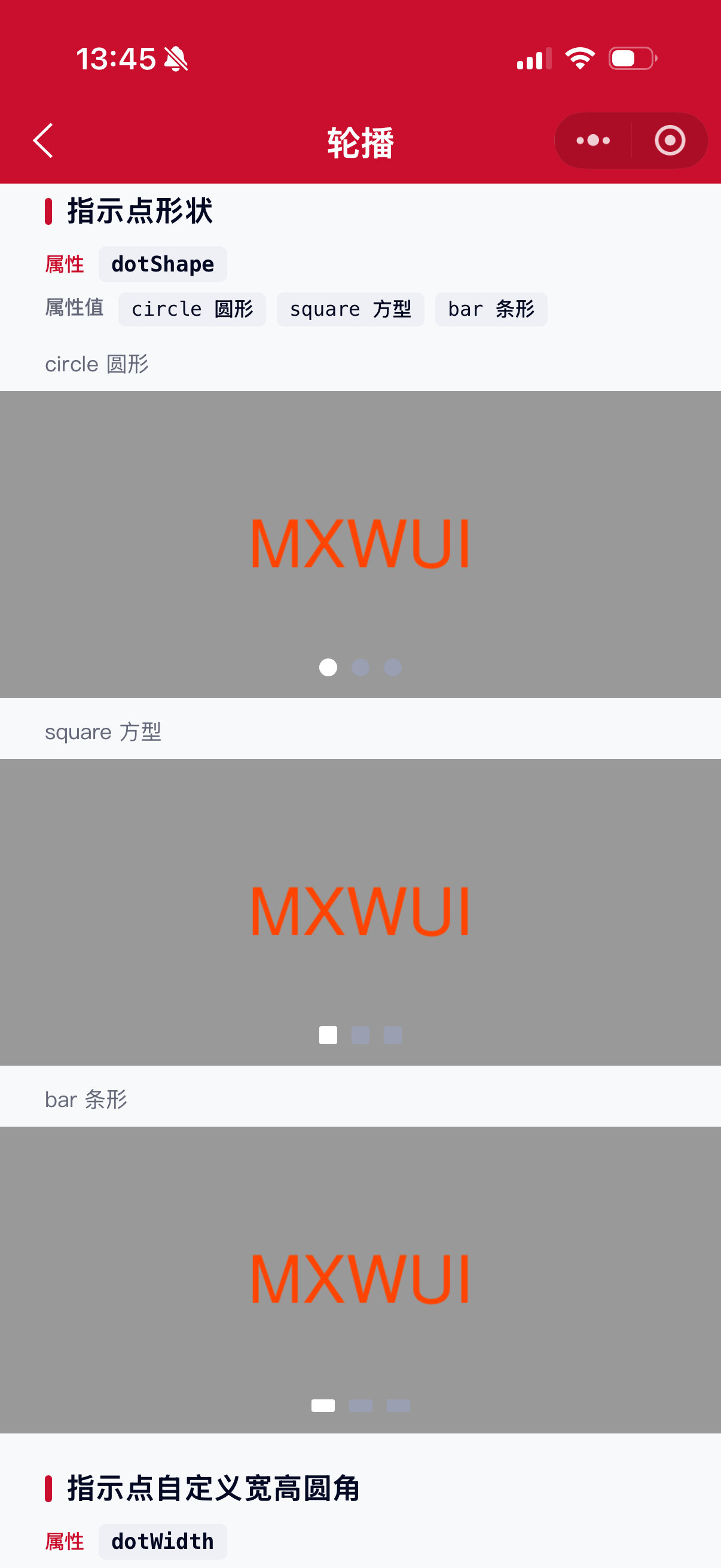
属性:dotShape,可选 circle 圆形、square 方型、bar 条形,默认 circle 原形。
- 圆形
<mx-swiper dotShape="circle" />- 方型
<mx-swiper dotShape="square" />- 条形
<mx-swiper dotShape="bar" />指示点宽 dotWidth
属性:dotWidth,数字,不带单位,默认使用rpx。
<mx-swiper dotWidth="24" />指示点高 dotHeight
属性:dotHeight,数字,不带单位,默认使用rpx。
<mx-swiper dotHeight="24" />指示点圆角 dotRadius
属性:dotRadius,数字,不带单位,默认使用rpx。
<mx-swiper dotRadius="24" />指示点边框颜色 dotBorderColor
属性:dotBorderColor,默认 #9AA0B1,支持任何合法的颜色值。
<mx-swiper dotBorderColor="#1677FF" />指示点边框选中颜色 dotBorderActiveColor
属性:dotBorderActiveColor,默认 #FFFFFF,支持任何合法的颜色值。
<mx-swiper dotBorderActiveColor="#1677FF" />点击时是否使用自定义事件 customHandle
属性:customHandle,默认 false 不使用。
默认点击事件的处理方式是根据url跳转页面,如果需要跳H5等链接或需要做其他处理,就需要使用自定义事件了,将 customHandle 设为 true 后将不会再执行默认的跳转处理,而是返回一个自定义事件 bind:swiper_tap,返回 index 和 item 字段,自行逻辑处理。
- 使用
<mx-swiper customHandle />

<mx-swiper customHandle="{{true}}" />- 不使用
<mx-swiper />

<mx-swiper customHandle />
自定义事件
事件:bind:swiper_tap,自定义点击事件,需要配合 customHandle 字段使用,返回 index 和 item 字段。
事件:bind:swiper_change,值变更事件,返回 current 字段。
事件:bind:swiper_transition,swiper-item 的位置发生改变时触发。
事件:bind:swiper_animation_finish,动画结束事件。
<mx-swiper
    bind:swiper_tap="handleTap"
    bind:swiper_change="handleTap"
    bind:swiper_transition="handleTap"
    bind:swiper_animation_finish="handleTap"
/>
参数
| 参数 | 类型 | 必填 | 可选值 | 默认值 | 参数描述 |
|---|---|---|---|---|---|
| options | Array | 是 | 数据项 | ||
| width | String | 750rpx |
swiper宽度,带单位 | ||
| height | String | 320rpx |
swiper高度,带单位 | ||
| radius | Number | 数字 | 0 |
swiper圆角,不带单位,默认使用rpx | |
| autoplay | Boolean | true、false |
true |
是否自动切换 | |
| current | Number | 数字 | 0 |
当前所在滑块 | |
| interval | Number | 数字 | 5000 |
自动切换间隔,不带单位,使用毫秒 | |
| duration | Number | 数字 | 500 |
滑动动画时长,不带单位,使用毫秒 | |
| circular | Boolean | true、false |
false |
是否采用衔接滑动 | |
| easingFunction | String | default 默认缓动函数、linear 线性动画、easeInCubic 缓入动画、easeOutCubic 缓出动画、easeInOutCubic 缓入缓出动画 |
default |
swiper切换缓动动画类型 | |
| displayMultipleItems | Number | 数字 | 1 |
同时显示的滑块数量 | |
| previousMargin | String | 前边距,可用于露出前一项的一小部分,带单位,支持px和rpx | |||
| nextMargin | String | 后边距,可用于露出后一项的一小部分,带单位,支持px和rpx | |||
| showDots | Boolean | true、false |
true |
是否显示指示点 | |
| dotBottom | Number | 数字 | 24 |
指示点距离底部距离,不带单位,默认使用rpx | |
| dotColor | String | 颜色值 | #9AA0B1 |
指示点颜色,支持任何合法的颜色值 | |
| dotActiveColor | String | 颜色值 | #FFFFFF |
指示点选中颜色,支持任何合法的颜色值 | |
| dotShape | String | circle 圆形、square 方型、bar 条形 |
circle |
指示点形状 | |
| dotWidth | Number | 数字 | 指示点宽,不带单位,默认使用rpx | ||
| dotHeight | Number | 数字 | 指示点高,不带单位,默认使用rpx | ||
| dotRadius | Number | 数字 | 指示点圆角,不带单位,默认使用rpx | ||
| dotBorderColor | String | 颜色值 | #9AA0B1 |
指示点边框颜色,支持任何合法的颜色值 | |
| dotBorderActiveColor | String | 颜色值 | #FFFFFF |
指示点边框选中颜色,支持任何合法的颜色值 | |
| customHandle | Boolean | true、false |
false |
点击时是否使用自定义事件 |
options
| 参数 | 类型 | 必填 | 可选值 | 默认值 | 参数描述 |
|---|---|---|---|---|---|
| img | String | 是 | 图片地址 | ||
| url | String | 跳转地址 |
事件
| 事件名称 | 类型 | 返回值 | 事件说明 |
|---|---|---|---|
| bind:swiper_tap | Click | event |
自定义点击事件,需要配合 customHandle 字段使用,返回 index 和 item 字段 |
| bind:swiper_change | Change | 值变更事件,返回 current 字段 |
|
| bind:swiper_transition | Change | swiper-item 的位置发生改变时触发 | |
| bind:swiper_animation_finish | 动画结束事件 |
其他说明
无