对操作结果的轻量级反馈,无需用户操作即可自行消失。最长文案不超过 2 行,最多可以显示 24 个字符,文案过长会被截断。
示例图
基础用法
页面 .json 文件 usingComponents 中引入组件
// json
{
    "usingComponents": {
        "mx-toast": "/components/mxwui/toast/index"
    }
}
页面 .wxml 文件中使用组件
<mx-toast
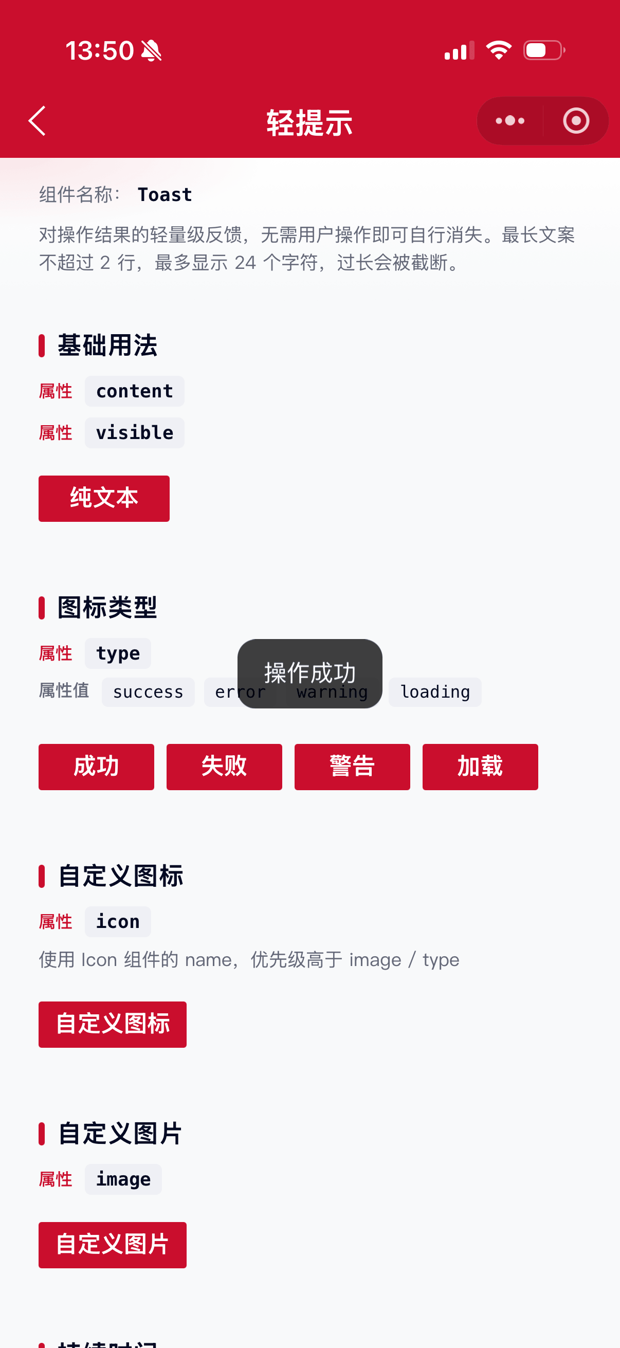
    content="操作成功"
    visible="{{visible}}"
    bind:toast_close="handleClose"
/>Page({
data: {
visible: false
},
handleShow() {
this.setData({ visible: true });
},
handleClose() {
this.setData({ visible: false });
}
});更多用法示例
是否显示 visible
属性:visible,默认 false。
<mx-toast visible="{{true}}" content="操作成功" />文本内容 content
属性:content,最多显示 24 个字符,超出截断并显示省略号;同时样式限制最多 2 行。
<mx-toast visible="{{visible}}" content="操作成功" />图标类型 type
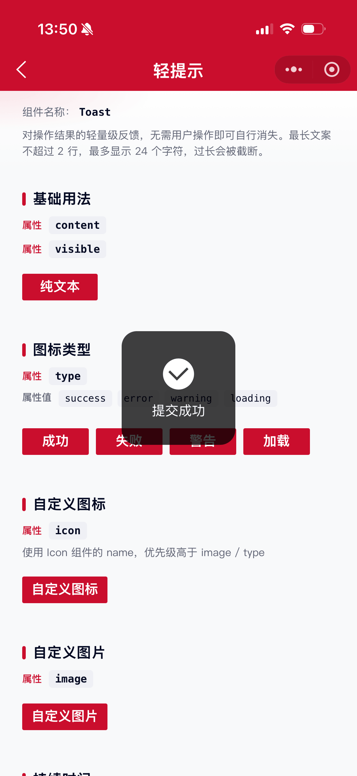
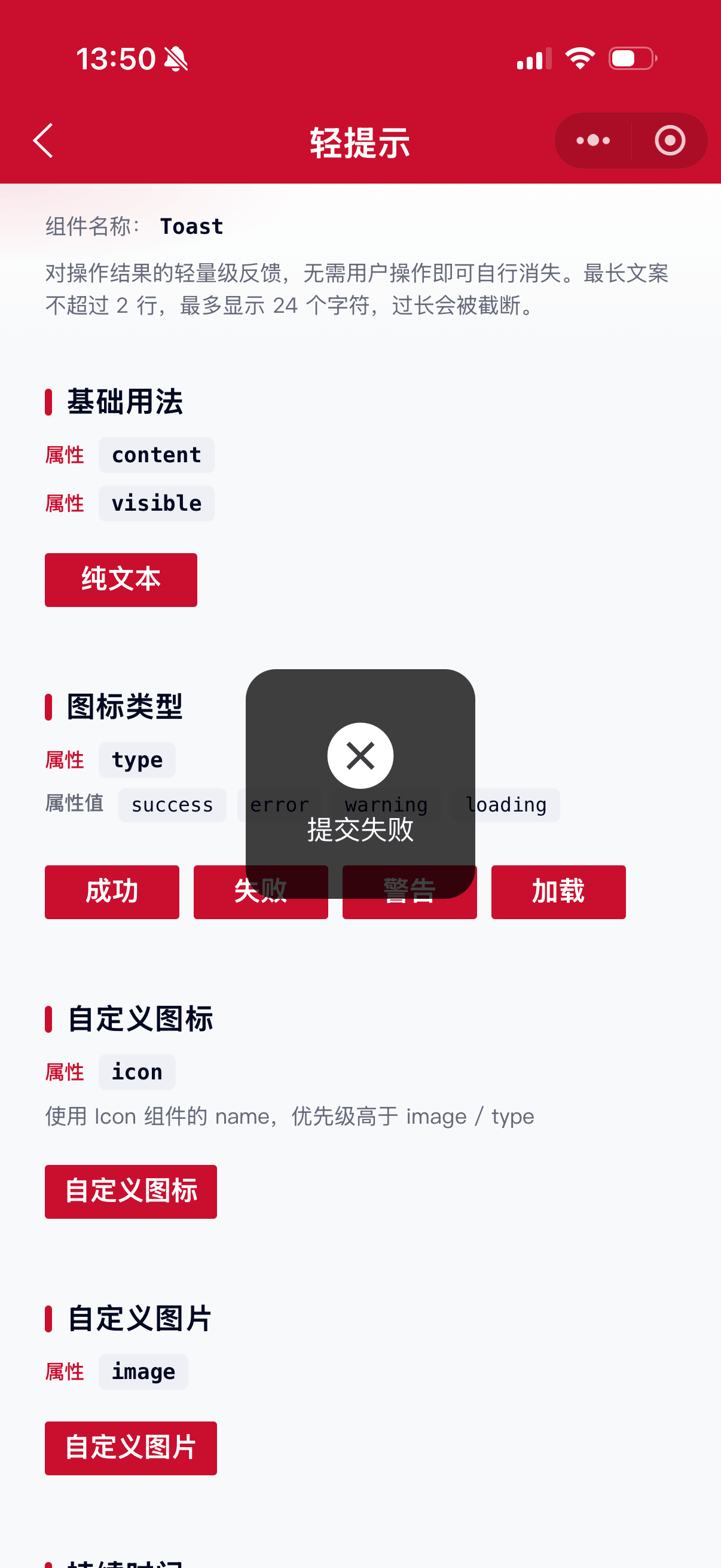
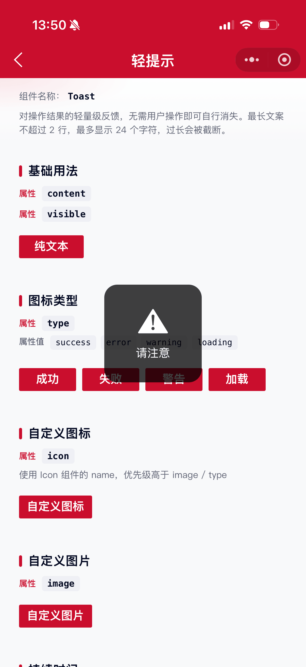
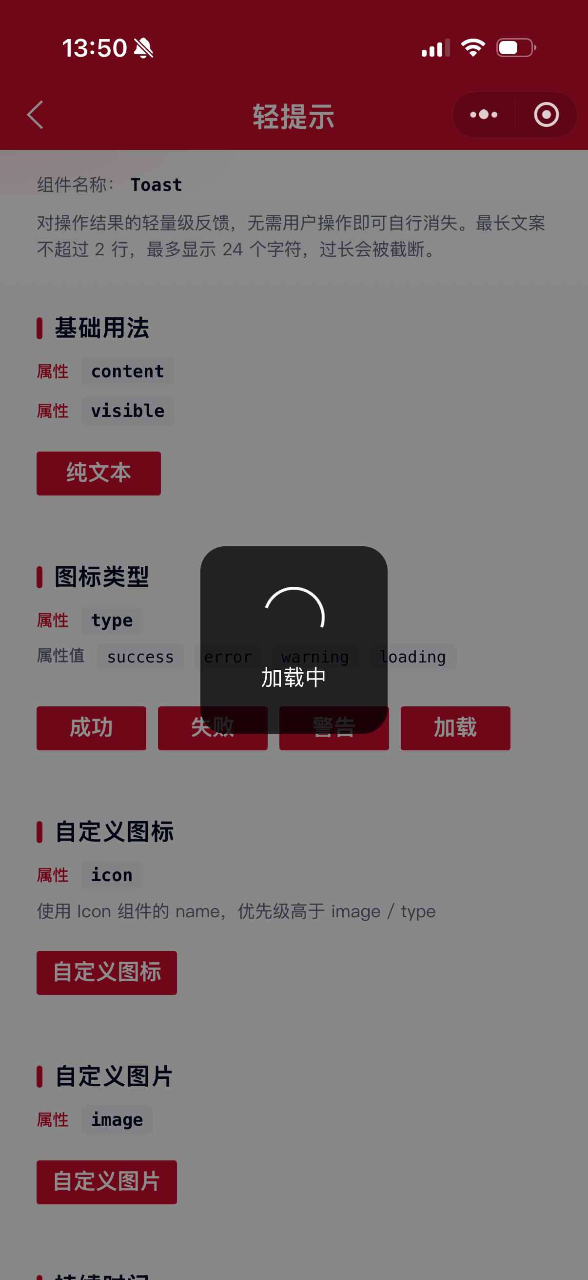
属性:type,可选 success、error、warning、loading。传入后展示对应内置图标。
<mx-toast visible="{{visible}}" content="提交成功" type="success" />
<mx-toast visible="{{visible}}" content="提交失败" type="error" />
<mx-toast visible="{{visible}}" content="请注意" type="warning" />
<mx-toast visible="{{visible}}" content="加载中" type="loading" time="{{0}}" />
自定义图标 icon
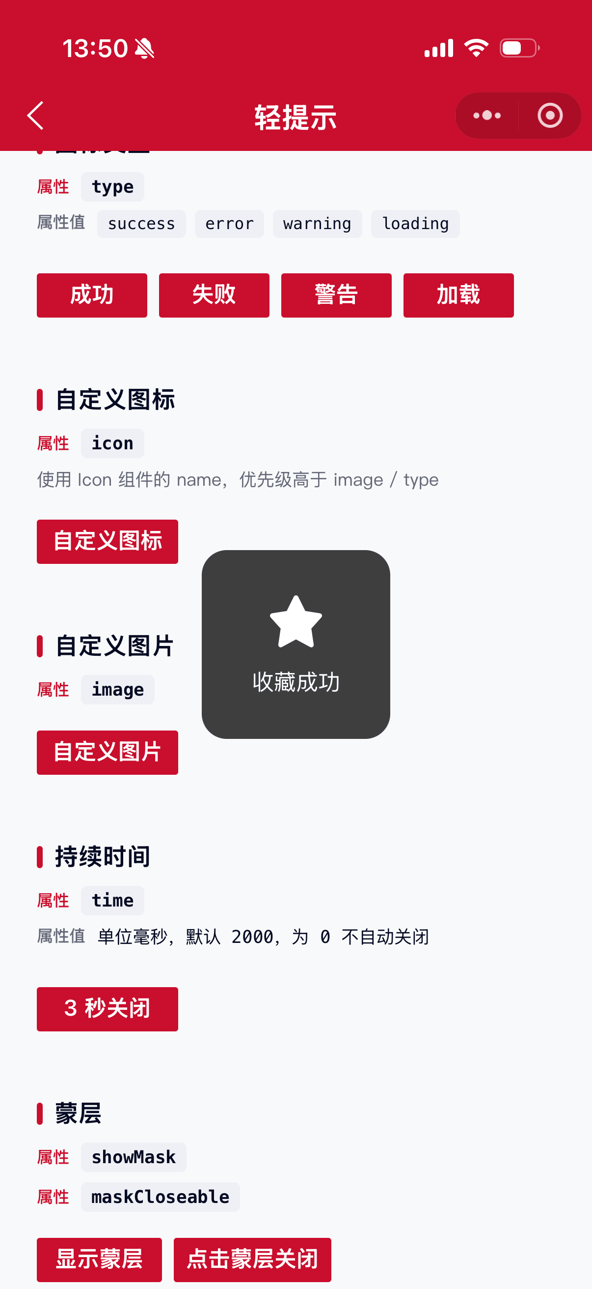
属性:icon,使用 Icon 组件的 name。与 image 互斥,且优先级高于 image / type。
<mx-toast visible="{{visible}}" content="收藏成功" icon="collect_checked" />自定义图片 image
属性:image,图片链接。无 icon 时生效。
<mx-toast
    visible="{{visible}}"
    content="自定义图片"
    image="https://example.com/icon.png"
/>
持续时间 time
属性:time,单位毫秒,默认 2000。为 0 时不会自动关闭。
<mx-toast visible="{{visible}}" content="3 秒后关闭" time="{{3000}}" />
<mx-toast visible="{{visible}}" content="不自动关闭" time="{{0}}" showMask maskCloseable />
持续时间 duration
属性:duration,单位毫秒。传入后优先生效(覆盖 time),为 0 时不会自动关闭。一般推荐使用 time。
<mx-toast visible="{{visible}}" content="3 秒后关闭" duration="{{3000}}" />蒙层 showMask / maskCloseable
属性:showMask 是否展示蒙层,默认 false;maskCloseable 点击蒙层是否关闭,默认 false。
<mx-toast
    visible="{{visible}}"
    content="点击蒙层关闭"
    showMask
    maskCloseable
    time="{{0}}"
/>
文字气泡圆角 textType
属性:textType,可选 short、long,默认 long。仅纯文本(无图标/图片)时生效;short 圆角更大。
<mx-toast visible="{{visible}}" content="已保存" textType="short" />
<mx-toast visible="{{visible}}" content="操作成功" textType="long" />
层级 zIndex
属性:zIndex,默认 999。
<mx-toast visible="{{visible}}" content="操作成功" zIndex="{{1000}}" />自定义样式 customStyle / maskStyle
属性:customStyle 写入内容区样式;maskStyle 写入蒙层样式。
<mx-toast
    visible="{{visible}}"
    content="自定义样式"
    customStyle="background:rgba(202,14,45,0.9);"
    showMask
    maskStyle="background:rgba(0,0,0,0.2);"
/>
自定义事件
事件:bind:toast_close,Toast 关闭后触发(自动关闭、点击蒙层关闭均会触发)。需在回调中将 visible 置为 false。
<mx-toast
    visible="{{visible}}"
    content="操作成功"
    bind:toast_close="handleClose"
/>
参数
| 参数 | 类型 | 必填 | 可选值 | 默认值 | 参数描述 |
|---|---|---|---|---|---|
| visible | Boolean | true、false |
false |
是否显示 | |
| content | String | 文本内容,最多 24 字符 | |||
| type | String | success、error、warning、loading |
内置图标类型 | ||
| icon | String | 自定义图标 name,优先于 image / type | |||
| image | String | 自定义图片链接 | |||
| time | Number | 数字 | 2000 |
持续时间(毫秒),0 不自动关闭 |
|
| duration | Number | 数字 | 持续时间(毫秒),传入后覆盖 time | ||
| showMask | Boolean | true、false |
false |
是否展示蒙层 | |
| maskCloseable | Boolean | true、false |
false |
点击蒙层是否关闭 | |
| maskStyle | String | CSS 字符串 | '' |
蒙层自定义样式 | |
| textType | String | short、long |
long |
纯文本气泡圆角类型 | |
| zIndex | Number | 数字 | 999 |
层级 | |
| customStyle | String | CSS 字符串 | '' |
内容区自定义样式 |
事件
| 事件名称 | 类型 | 返回值 | 事件说明 |
|---|---|---|---|
| bind:toast_close | Close | Toast 关闭后触发 |
其他说明
- 媒体展示优先级:
icon>image>type。 - 有图标/图片/loading 时使用方形大尺寸容器;纯文本时由
textType控制圆角。 type="loading"通常配合time="{{0}}"与showMask使用,并在业务完成后将visible置为false。- 推荐使用
time(毫秒);若同时传入duration,以duration为准。 - 关闭后务必在
toast_close回调中同步页面的visible状态。