CSS3放大旋转动画
本文写于 2015 年,距今已有 11 年,文中提及的技术方案与接口可能已经过时,请注意甄别参考。
公司的APP要改版,APP的首页比之前好看多了,但是需要加些动画效果,用以突出产品受欢迎的程度。表现的方式就是一个圆带有光晕,然后不停的缩放。
想了半天一开始用两个div,边框+内边距+阴影来实现,勉强实现了效果,但是不理想,动画很生硬,不是我想要的效果。后来想着把图片剥离出来分两层来弄。
效果如下:
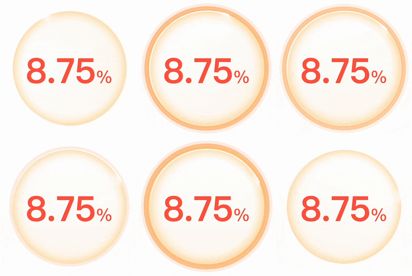
用的是两层结构,使用定位相应的覆盖,背景层的图片实际是比内容层大的,在初始的时候是缩小了,动画出来的时候再放大,内容层有个高亮的进度条,顺便加了旋转效果。
HTML代码:
<div class="round-wrap">
    <img class="round" src="images/round_bg.png" />
    <img class="round-bg" src="images/round_bg2.png" />
    <strong class="rate">8.75<b>%</b></strong>
</div>
CSS代码:
.round-wrap {
    position: relative;
    width: 485px; height: 485px;
}
.round-bg {
    position: absolute; top: 30px; left: 30px; z-index: 1;
    width: 400px; height: 400px;
    -webkit-animation: scaleOut 1.3s 2s infinite ease;
    animation: scaleOut 1.3s 2s infinite ease;
}
.round {
    position: absolute; top: 30px; left: 30px; z-index: 2;
    -webkit-animation: rotateRound 5s infinite ease-in-out;
    animation: rotateRound 5s infinite ease-in-out;
}
.rate {
    position: absolute; top: 125px; left: 30px; z-index: 3;
    display: block;
    width: 400px;
    color: #ff5b45;
    font-family: 'Microsoft YaHei';
    font-size: 120px;
    text-align: center;
}
.rate b {
    font-size: 30px;
}
@-webkit-keyframes scaleOut {
    0% {
        transform: scale(1.0);
    }
    70% {
        transform: scale(1.15);
        opacity: 1;
    }
    100% {
        opacity: 0;
    }
}
@-webkit-keyframes rotateRound {
    0% {
        transform: rotate(0deg);
    }
    100% {
        transform: rotate(360deg);
    }
}
素材如下:


若有共鸣,不妨点个喜欢
本文地址:https://www.mingsixue.com/blog/detail/CSS3-animation-scale-rotate
文章若需转载,请附上原文链接,谢谢配合。^_^